Blood Donor
American Red Cross
Improving the experience of blood donors booking their appointment
Introduction
What is the Blood Donor App?
Blood Donor is mobile and web app that allows people to find and book blood donation appointments, track where their blood ends up and earn rewards.
Jump to case study
Impact
Stats from my time on the project

Over the past 3 and a half years, I have been the lead designer on the American Red Cross Blood Donor app.
Context
Users highlighted that choosing an appointment time felt cumbersome.
We conducted a research exercise to see how we could improve the experience of users choosing and booking a blood donation appointment.
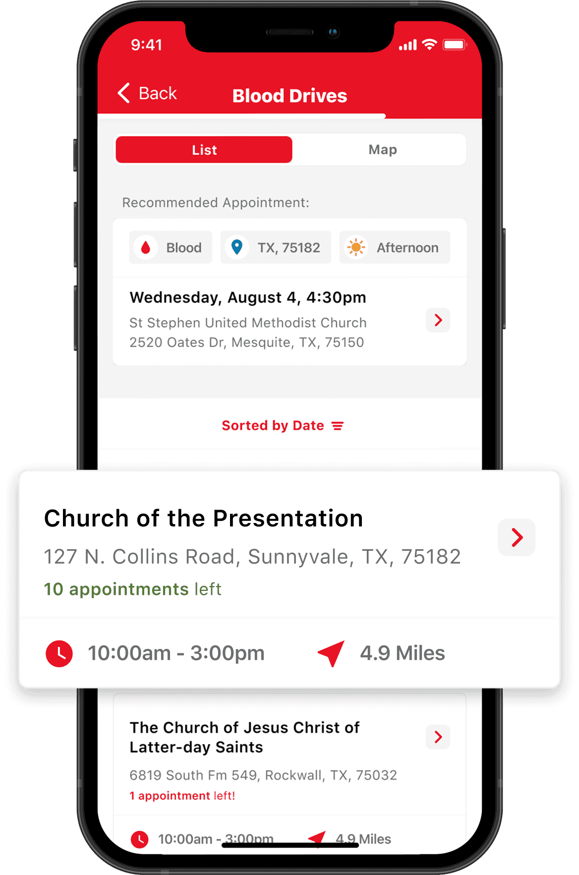
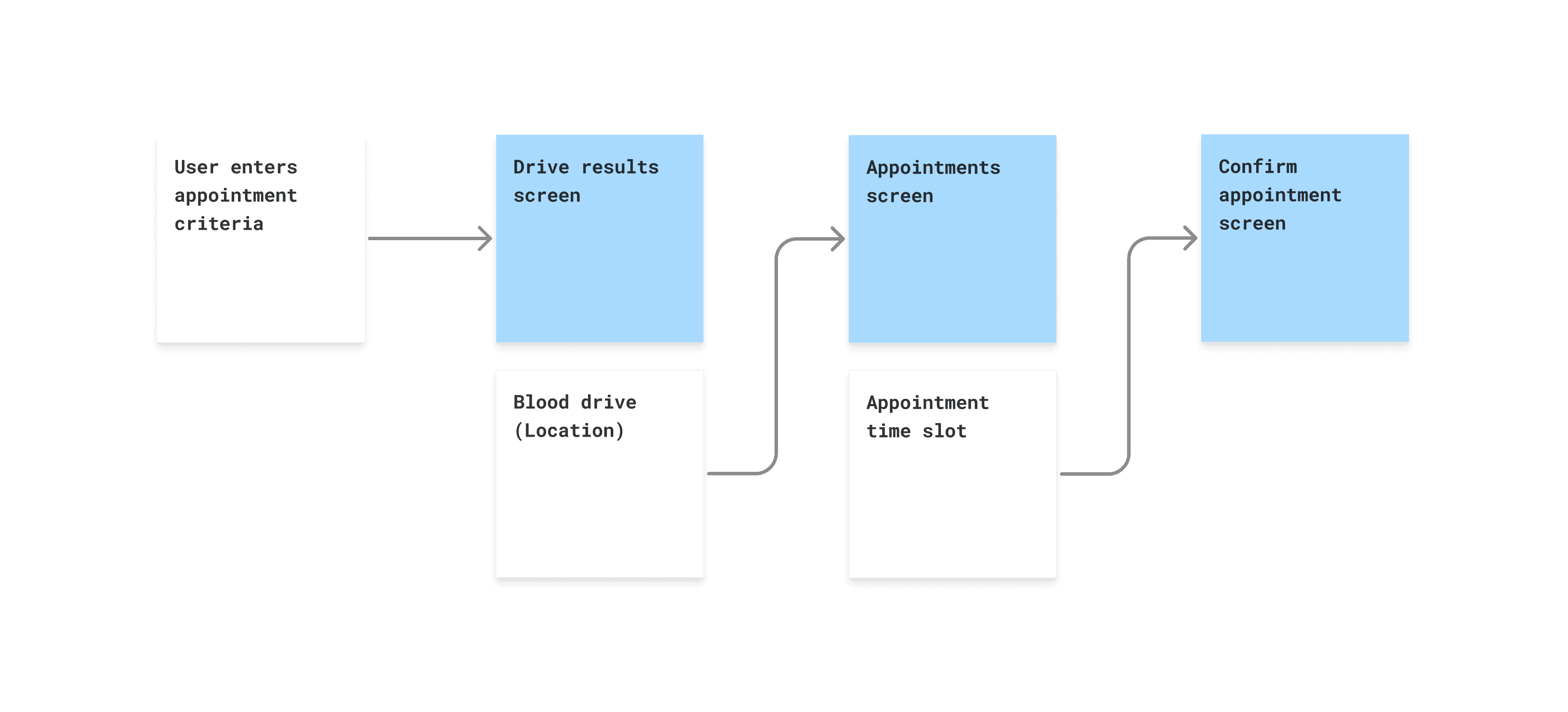
Existing Flow
Taps before seeing appointment time
The existing flow consisted of users seeing a search results screen, followed by a detail screen with the appointment times available for that location, followed by another confirmation screen.
Prototypes
User testing
In this project, we were able to show some prototype concepts to users. We found that most users preferred being able to open a drop-down on the search results screen. Even though the amount of clicks were the same, users said this felt quicker.
Current Flow
Separate appointment times screen
Concept 1
See times on drive results screen
Concept 2
Show appointment times on confirm screen
UI Iteration
Digestible, concise, informative
I worked on the design treatment for this new component, with the goal of maximising clarity and legibility of appointment times. The client also made a request to reinforce the donation type that was being made at this point in the flow.
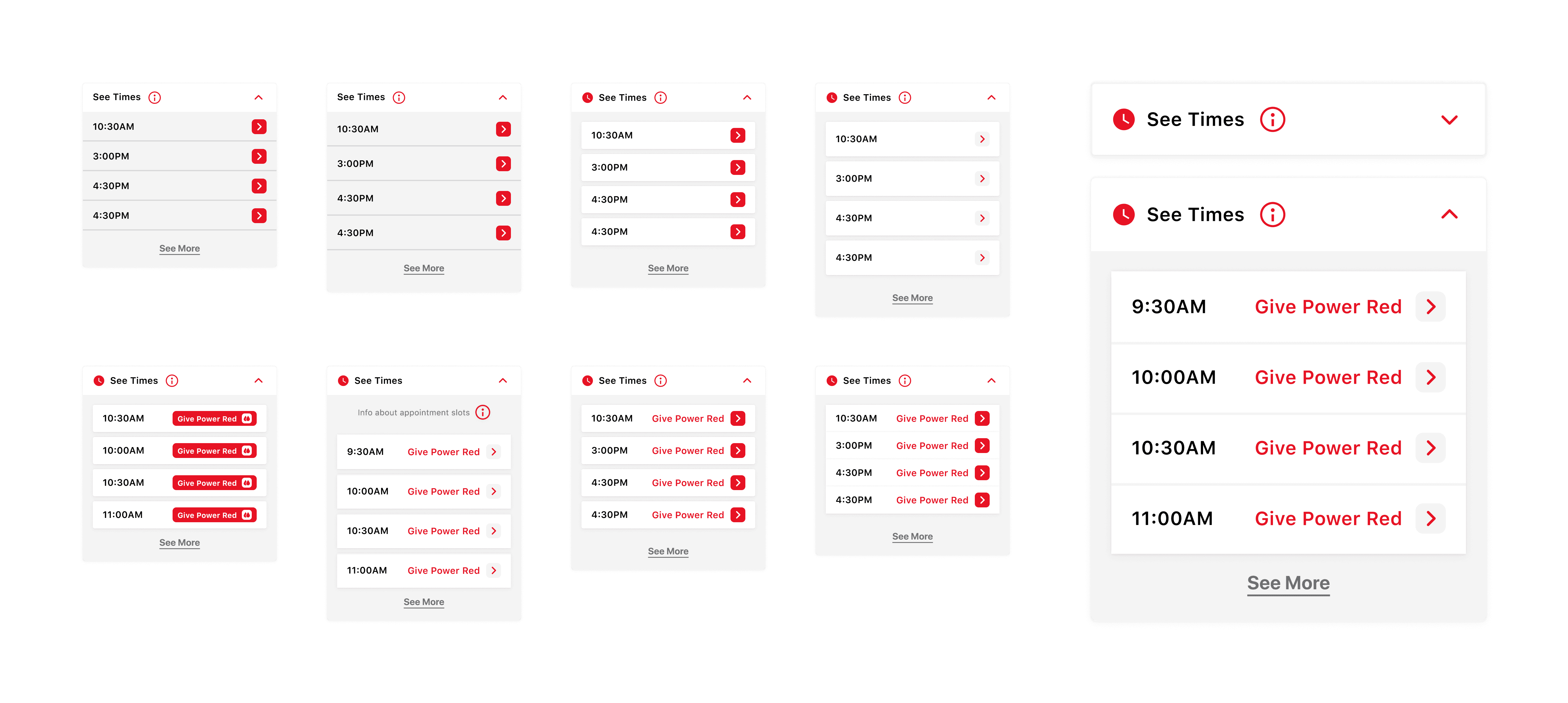
Iterations of drop-down UI
Interaction
Drop-downs and skeleton state
Due to a technical constraint, appointment times could be not loaded instantly, which required a state to re-assure the user that the information was being loaded.
Feedback
App store reviews
Since the release of the change, we noticed more mentions about speed and ease of use of booking an appointment in app store reviews.
26 January 2023
Makes donating blood simple and convenient. Gives you updates when you are allowed to give again, and it allows you to find drives and make appointments in no time.
2 March 2023
I have been donating blood for over 20 years and I feel that the Red Cross is making the app and donating easier all the time. Thank you.
8 March 2023
Easy to use. Intuitive menus make it simple to schedule donations and complete rapid passes.
Case Study 2
Creating feedback loops
Update Released
June 2024
Timescale
12 weeks
Context
Create another way to capture user feedback
We wanted to gain more insight into how users felt about the current appointment booking flow.
Ideation
Concepts for collecting feedback
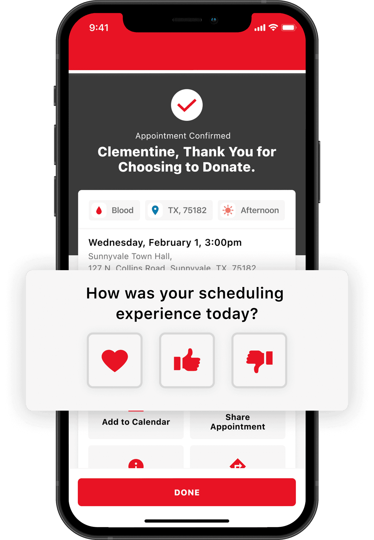
Looking at the existing flow for booking an appointment, my hypothesis was that it could be effective to ask users for feedback after they had just booked an appointment. I also flowed out a concept for users abandoning the booking process.
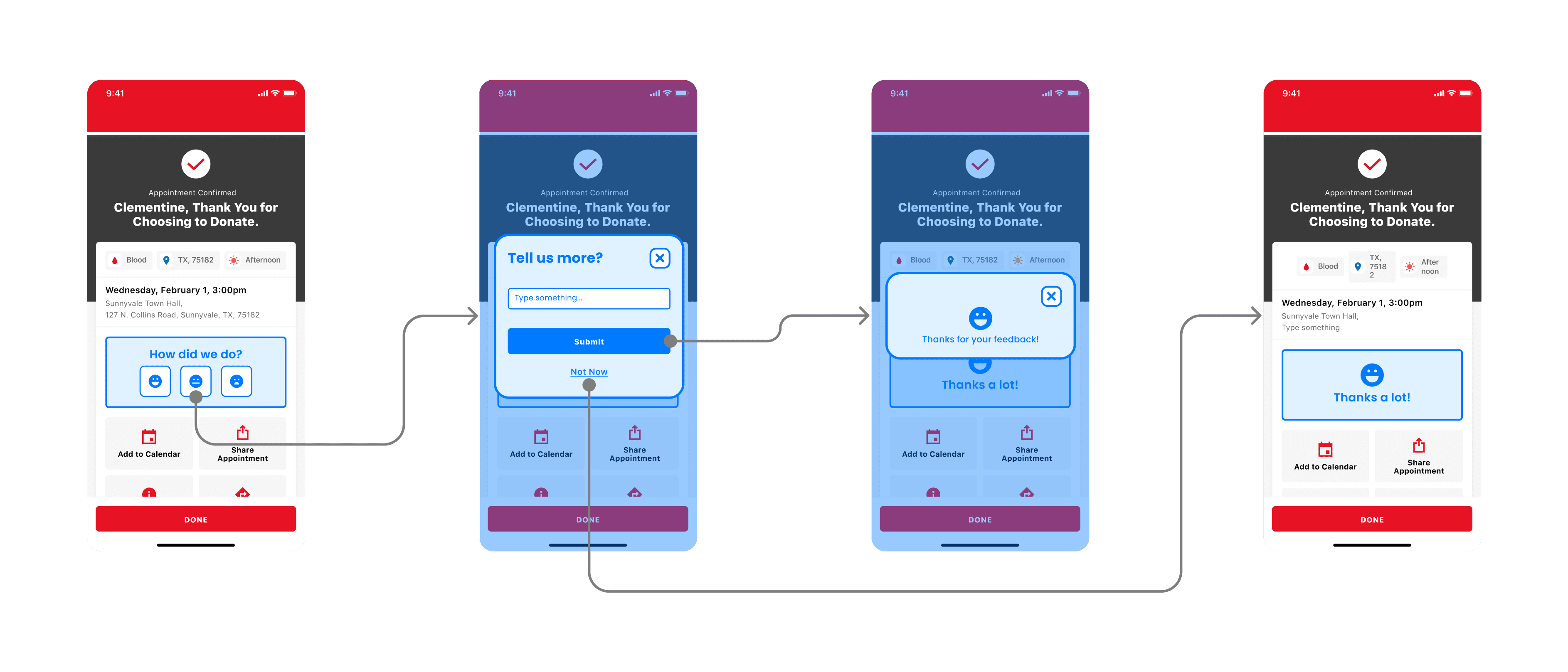
Feedback post booking success 1
Feedback post booking success 2
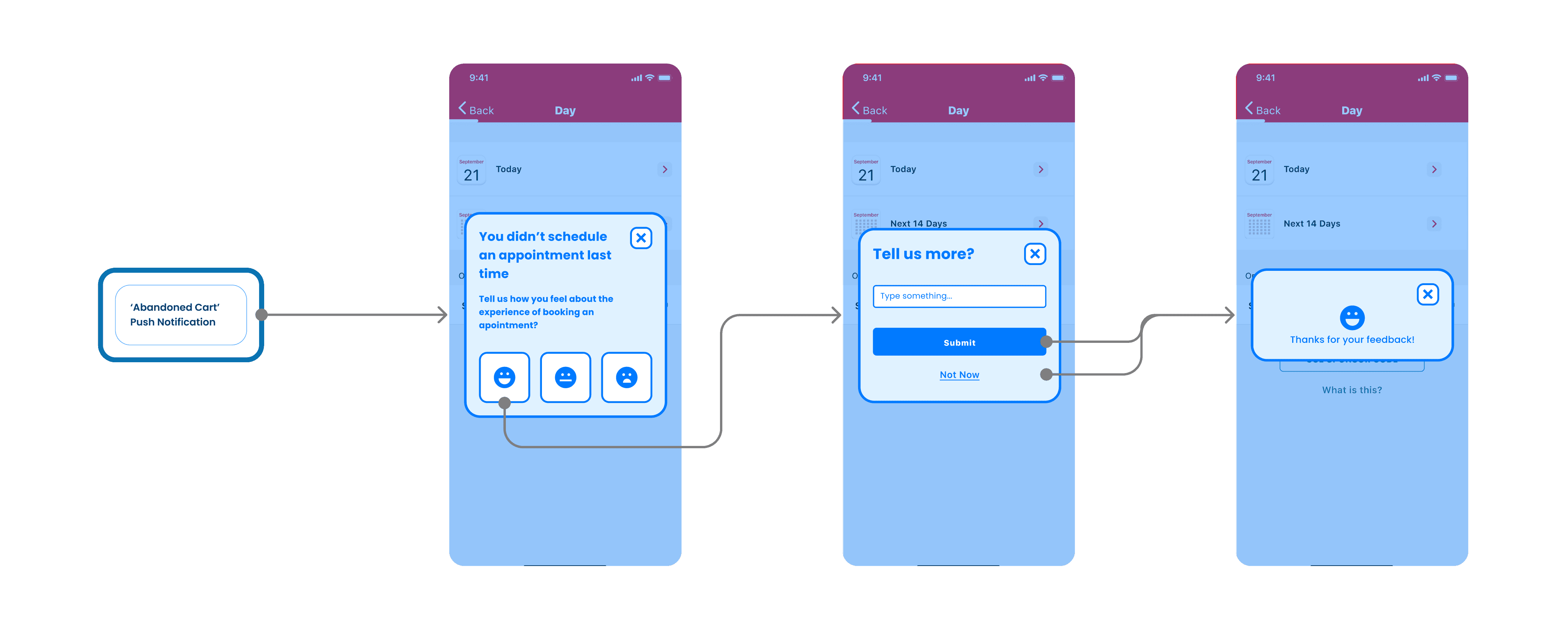
Feedback post abandoned booking
Flows
Final version
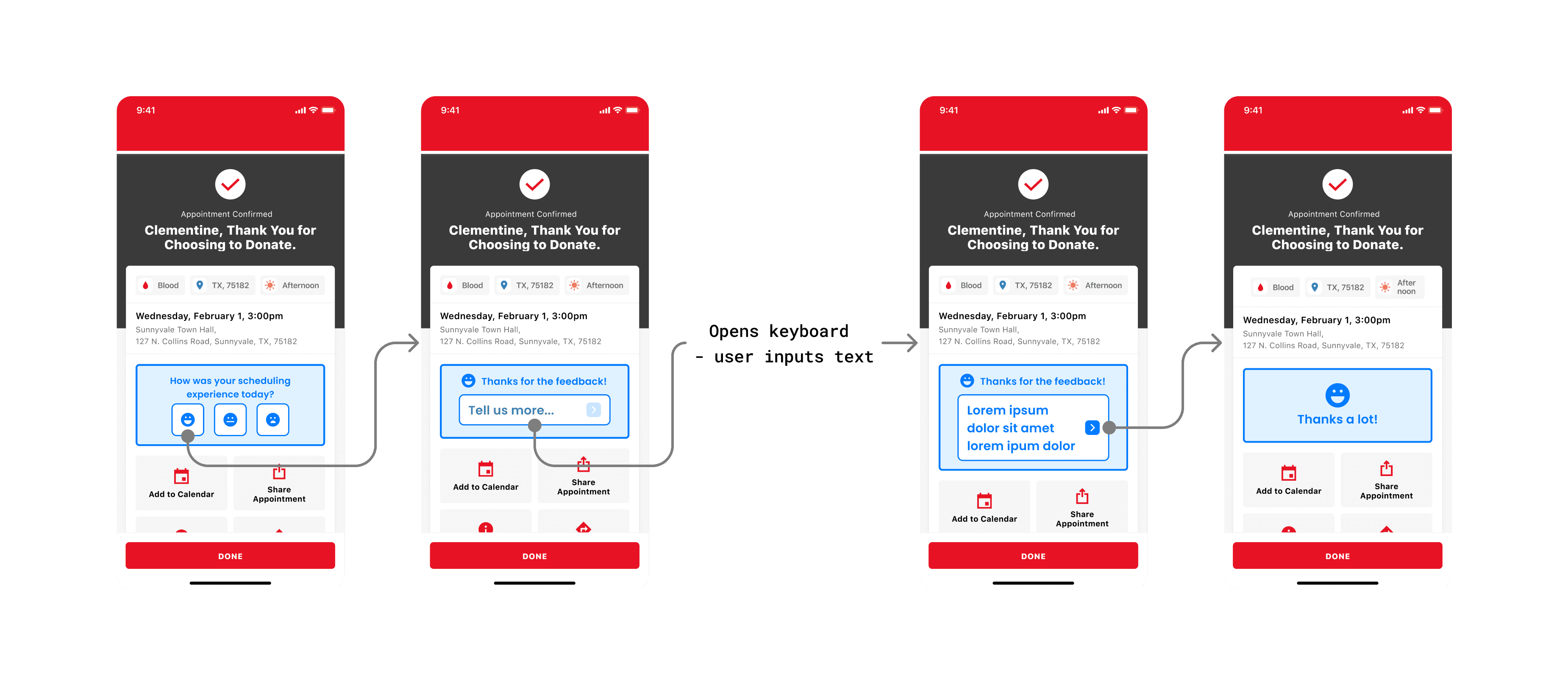
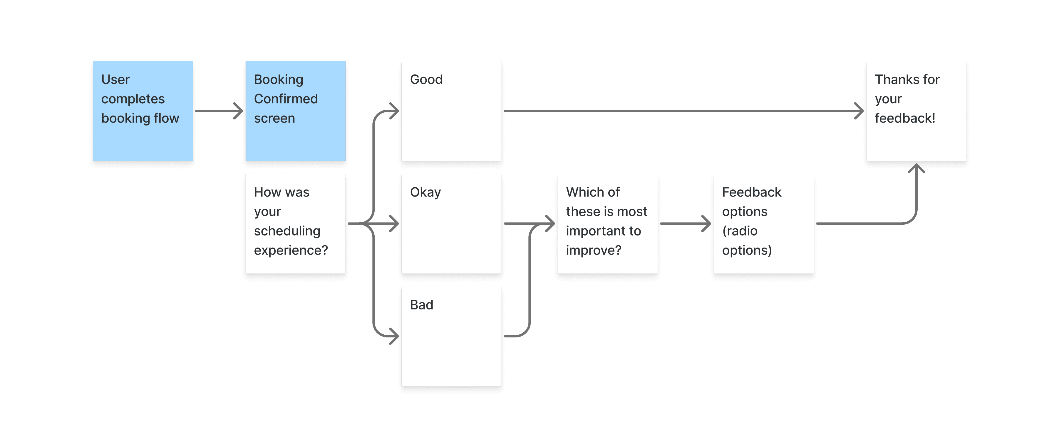
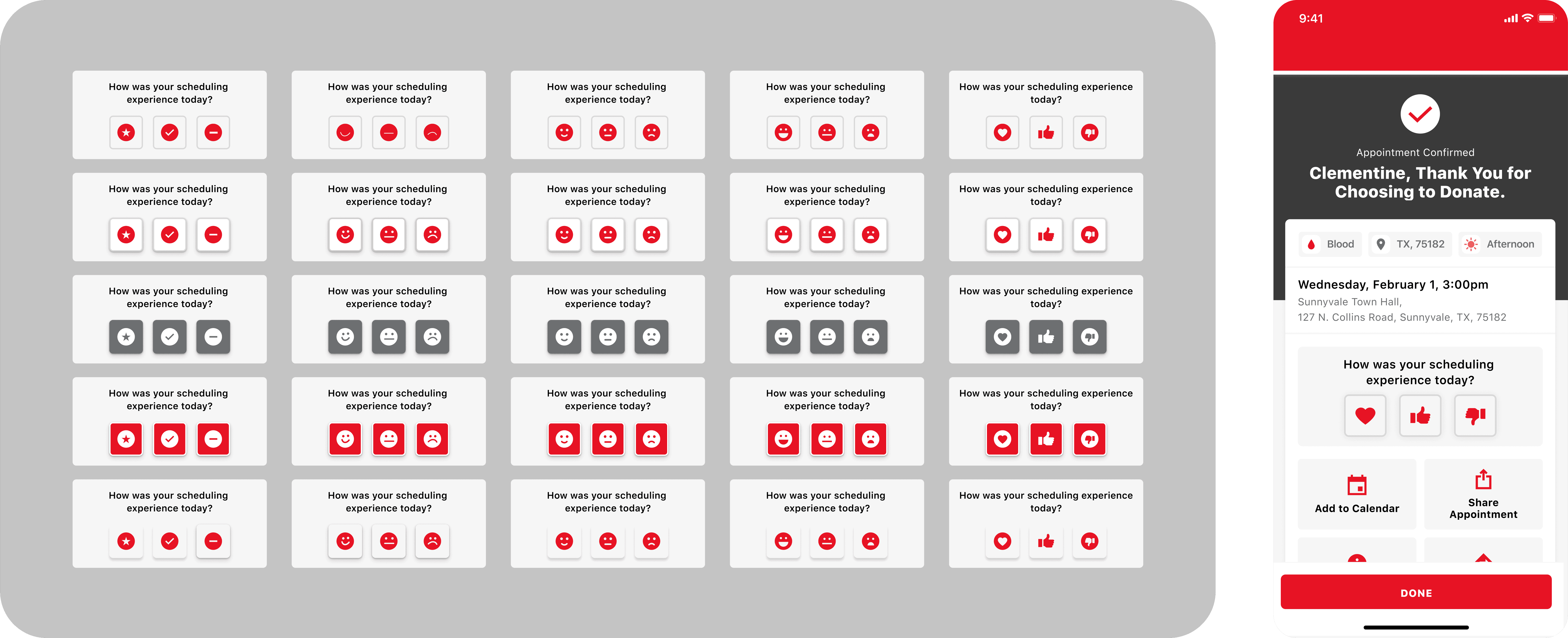
We got buy-in from stakeholders to move forward with the concept of capturing feedback after appointment booking. For the first version of this feature, we chose to capture pre-determined responses from users, rather than allow a free-text response.
UI Iteration
Avoiding competing CTAs
I created many iterations of the feedback CTA component experimenting with different iconography and button treatments. It was important that the new component did not compete too heavily and detract from the other actions onscreen.
Interaction
Drop-down options
I prototyped out how the interaction of opening the radio button list would feel. Keeping the UI as simple as possible was important to make this interaction easy to comprehend.
Impact
What did we learn?
Since the release of the scheduling feedback update, we had steady engagement. With some contradictory information about ease of booking.
52%
Users who responded
selected “booking an appointment with ease”
3801
Responses
(Since June 2024)
1 in 800
Of total users
chose to leave feedback
Case Study 3
Showing donors their health data
Update Released
November 2021
Timescale
6 weeks
Challenges
Considerations for the UI
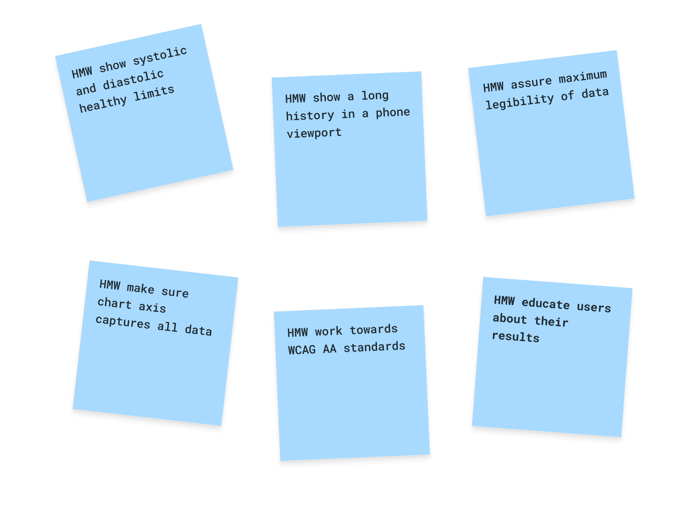
To begin, we produced some ‘How Might We’ statements to frame the challenges of the project.
Ideation workshop with EA and Lancashire Youth Council
UI Iteration
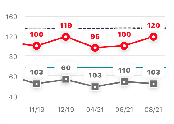
Accounting for use of colour
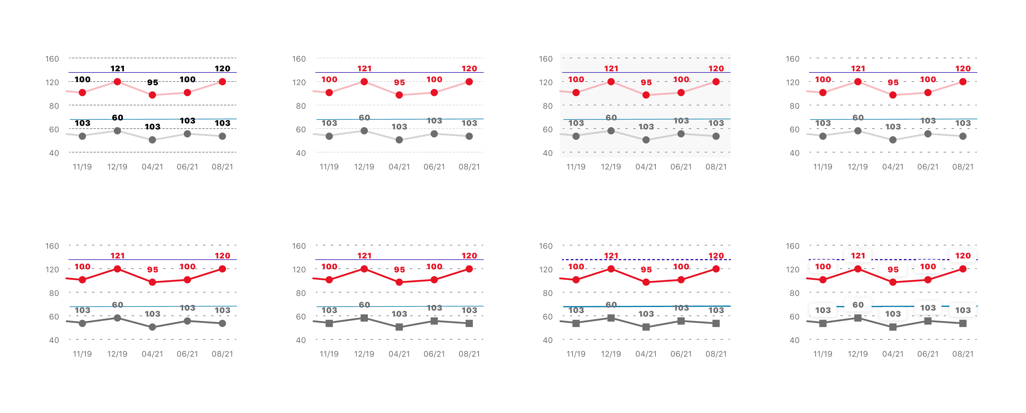
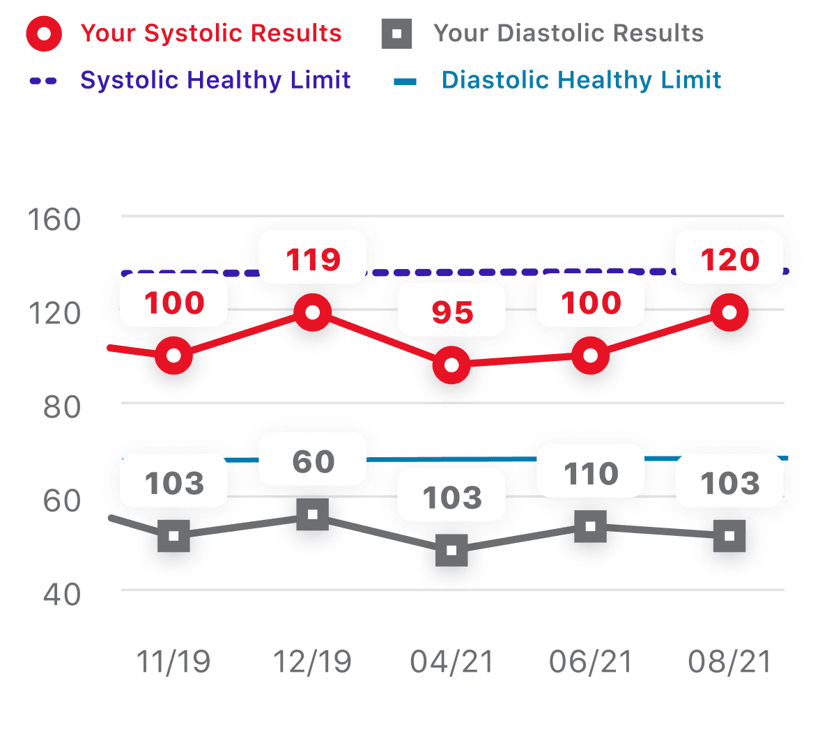
During iteration of the chart UI, I became cognisant of the fact that for the key explaining the chart to be more accessible, I needed to account for the two data points being distinguishable aside from their colour.
Accessibility
Making charts more accessible
By using different shapes and line styles for the 2 data points, the chart is readable for users who don't necessarily know about blood pressure readings and may have a form of colour blindness.
(Trichromacy) No Colour Blindness
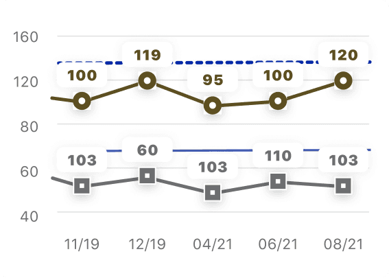
Deuteranopia
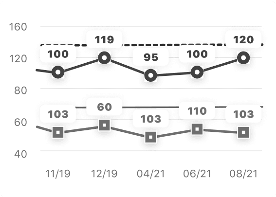
Achromatopsia
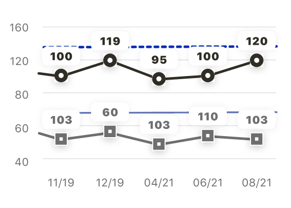
Protanopia
Tritanopia
Interaction
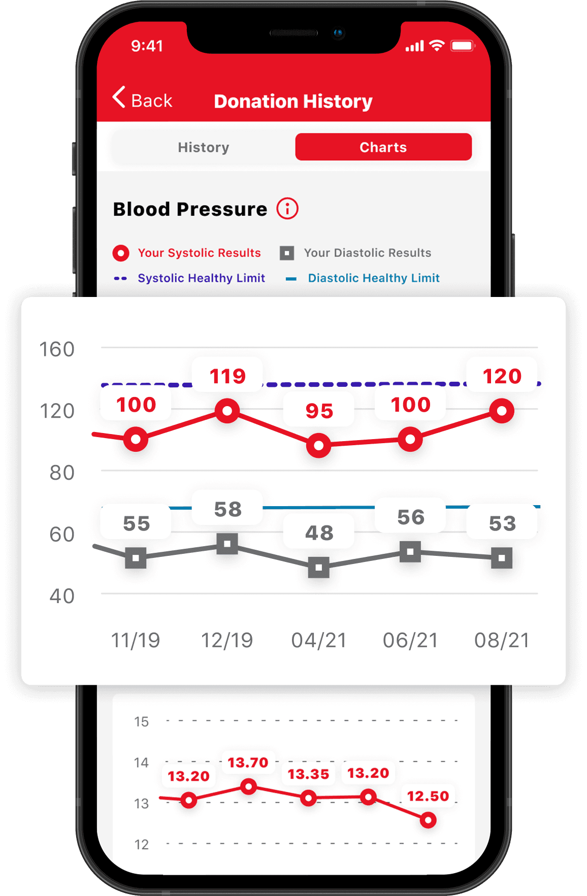
Showing a user's full journey
Some users of the app have been donating blood for many years, we needed a way to allow users to see their data up to 2 years in the past.
Feedback
What was the user reaction?
Since charts have been introduced, there has been a very positive interaction from users who value seeing health data in this format.